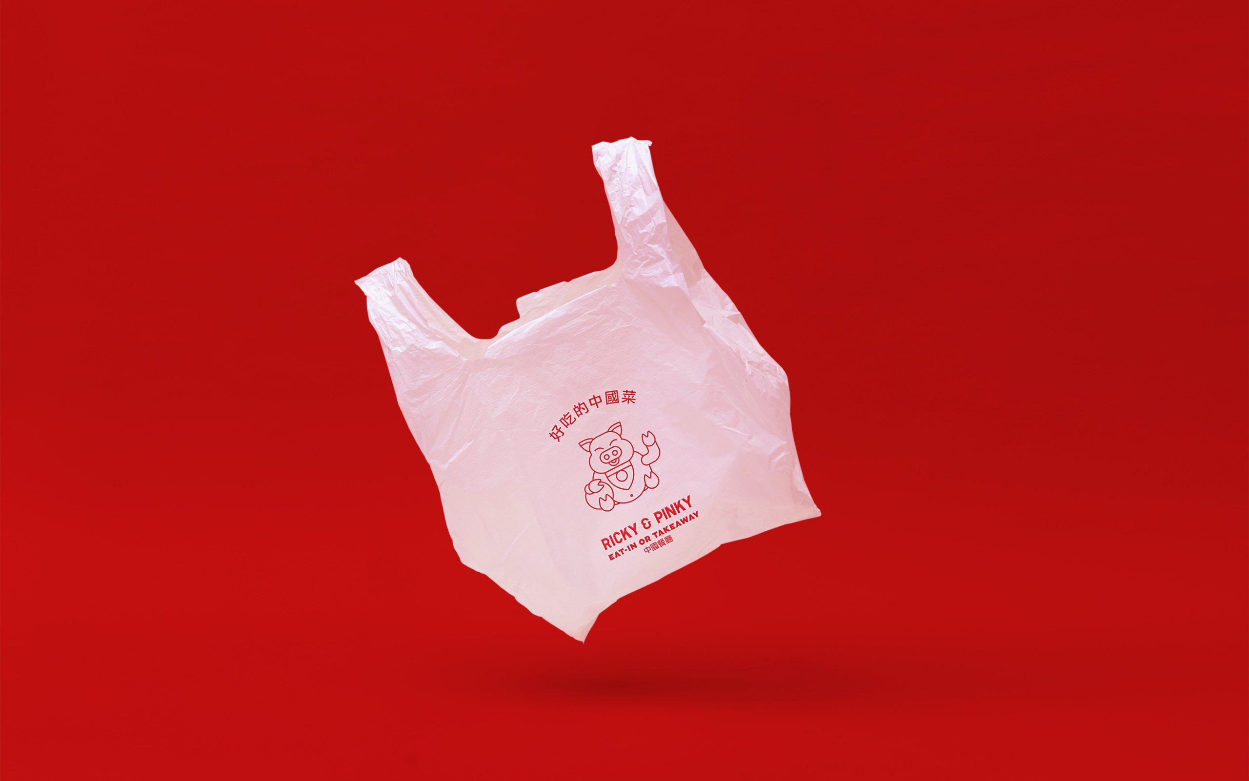
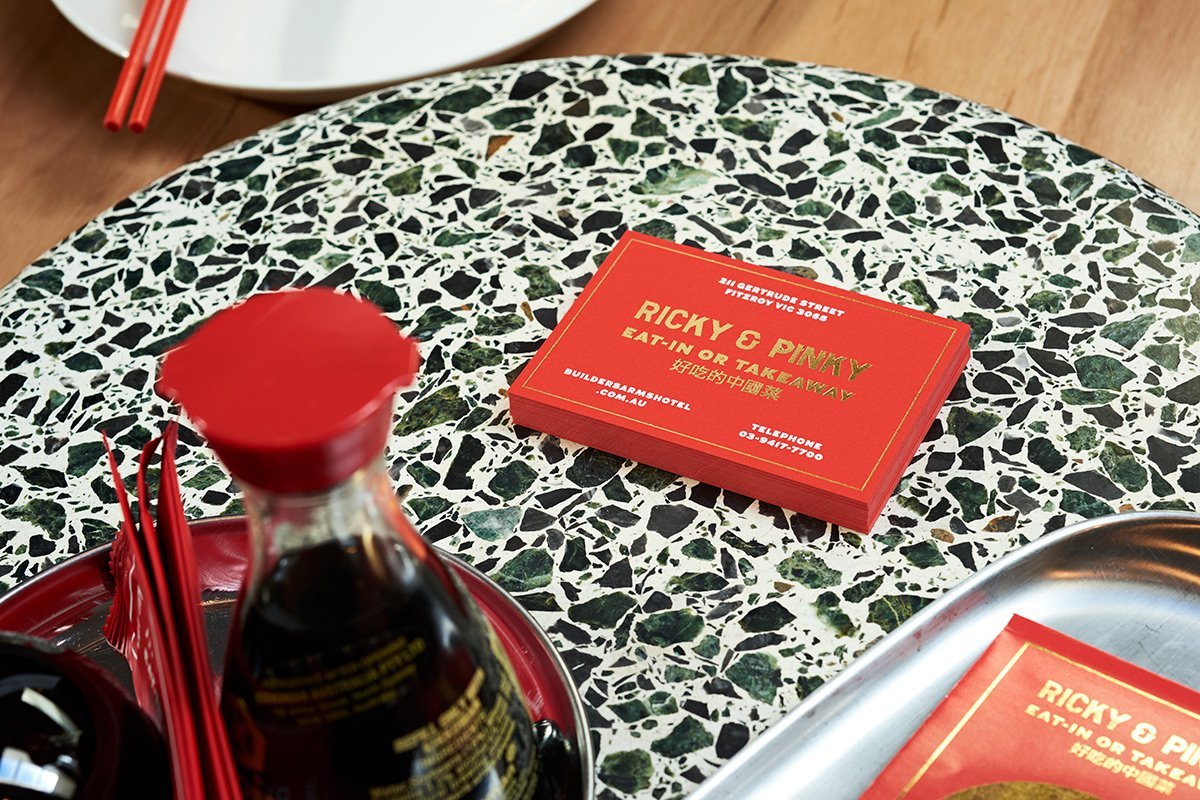
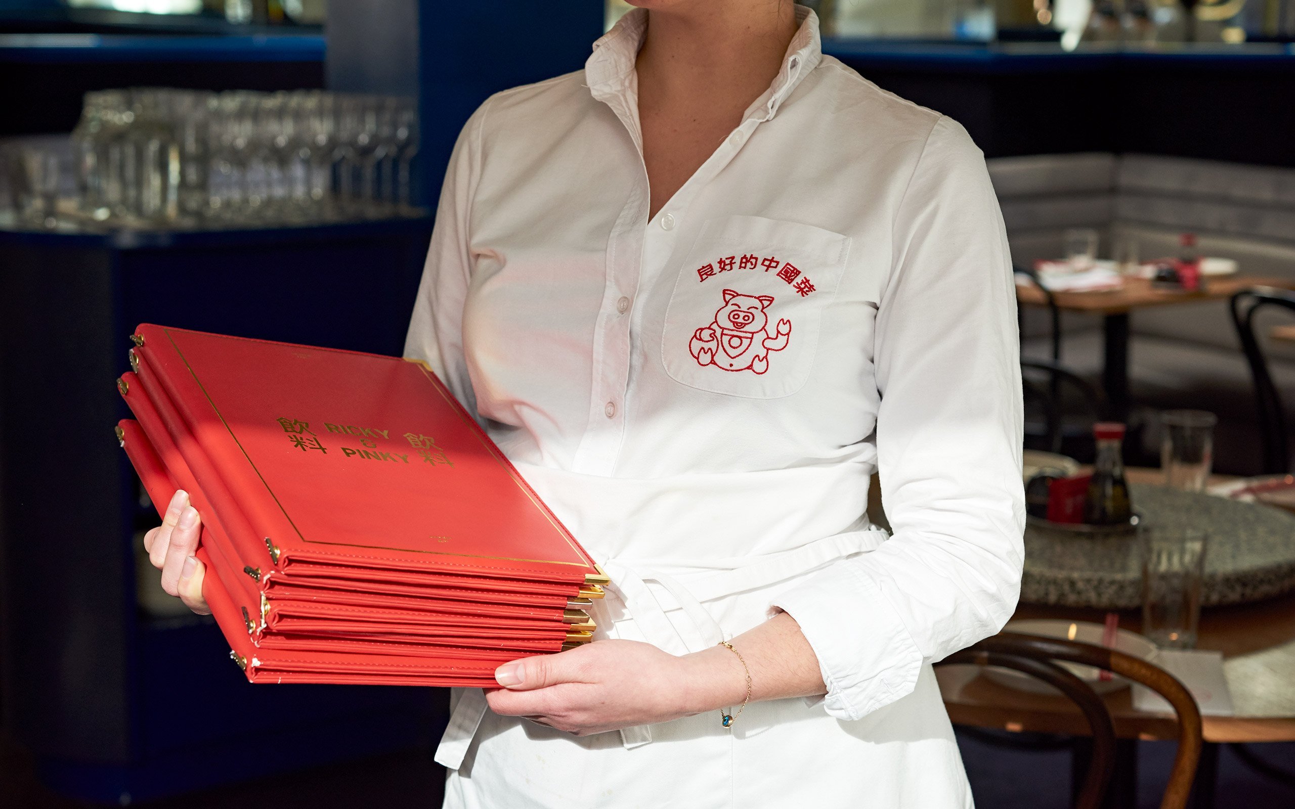
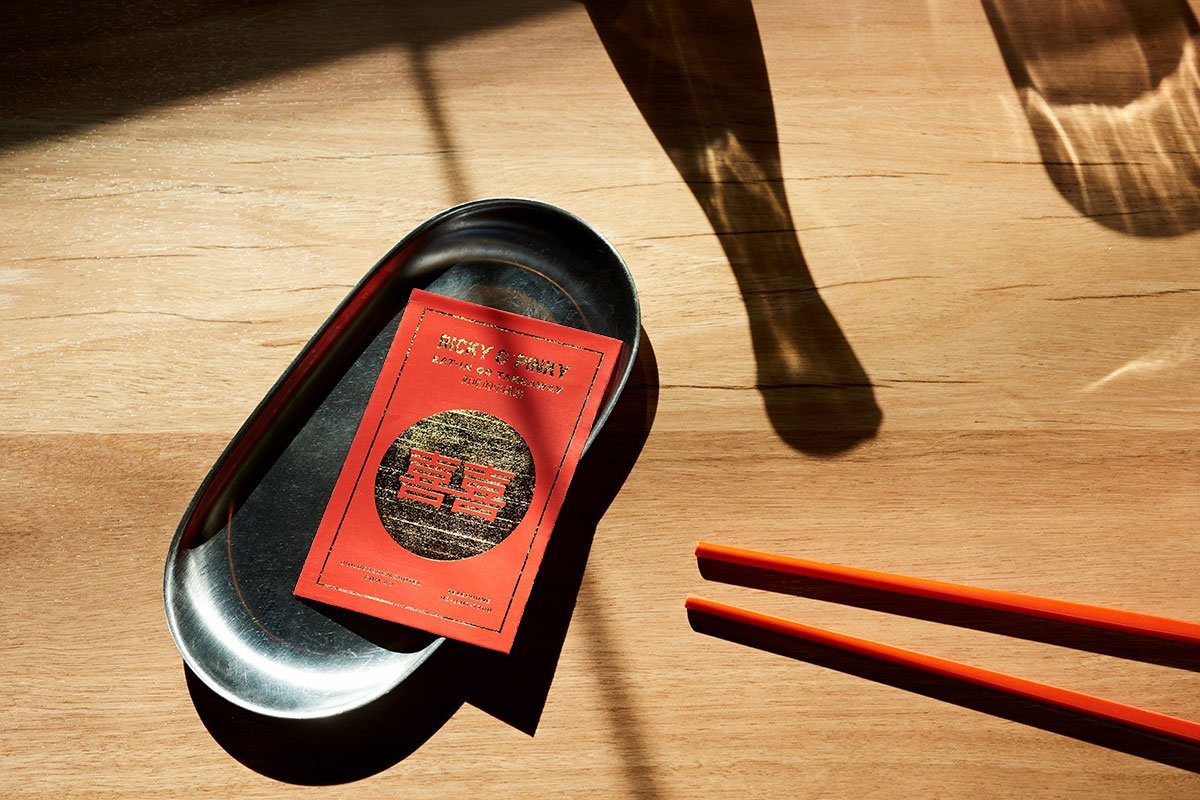
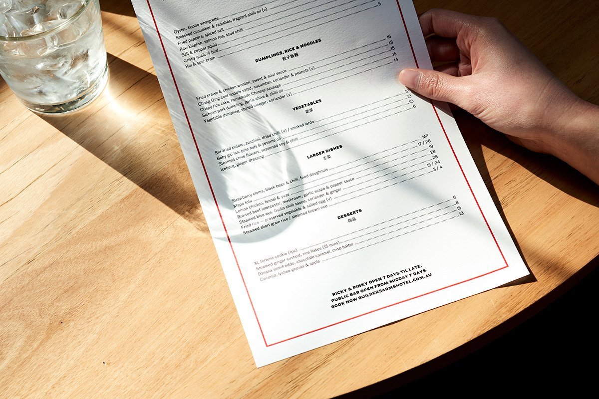
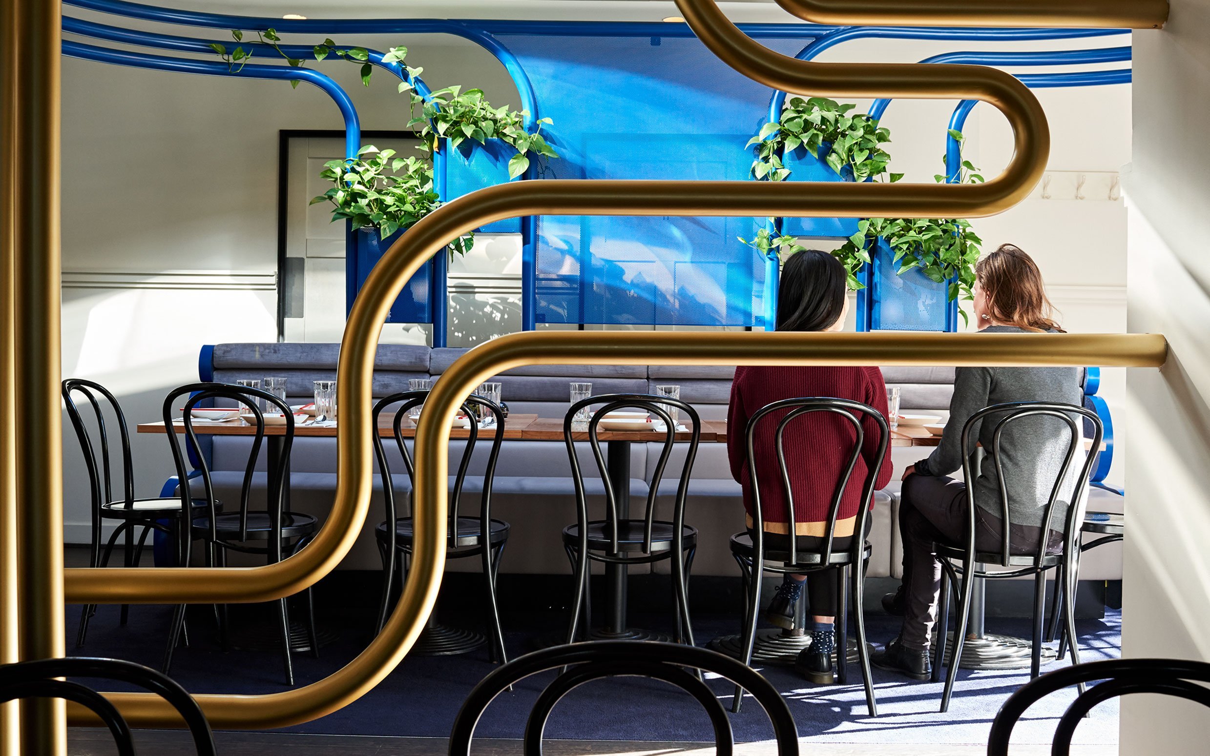
We want to share an interesting branding case, Ricky & Pinky, a gilt-lined Chinese restaurant. In close collaboration with Architecture and Interior design team, this restaurant seems succefuly set about bringing cultural collision to the brand.
The identity was designed by Round Studio, a imaginative design studio from Melbourne. They say they are a “design practice that harnesses culture and creativity to transform brands”,
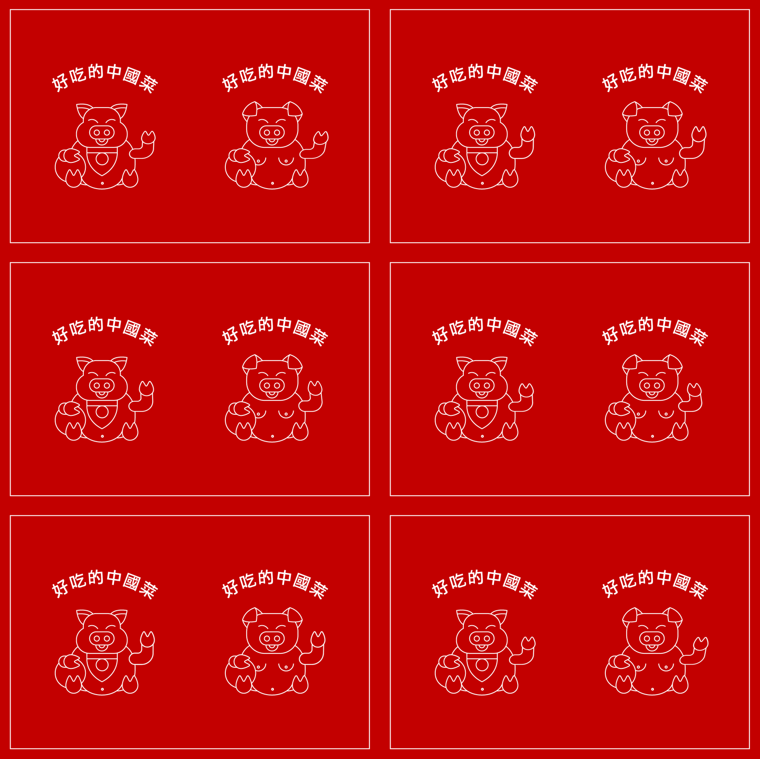
我們可以看到不一樣的中文元素運用,惡搞的發財豬,紅包的玩法。
3 条回复
@
好棒!管理员快更新!
@
洋气噢
@
我喜欢这个配色