
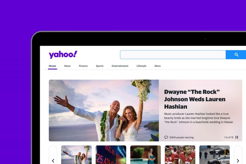
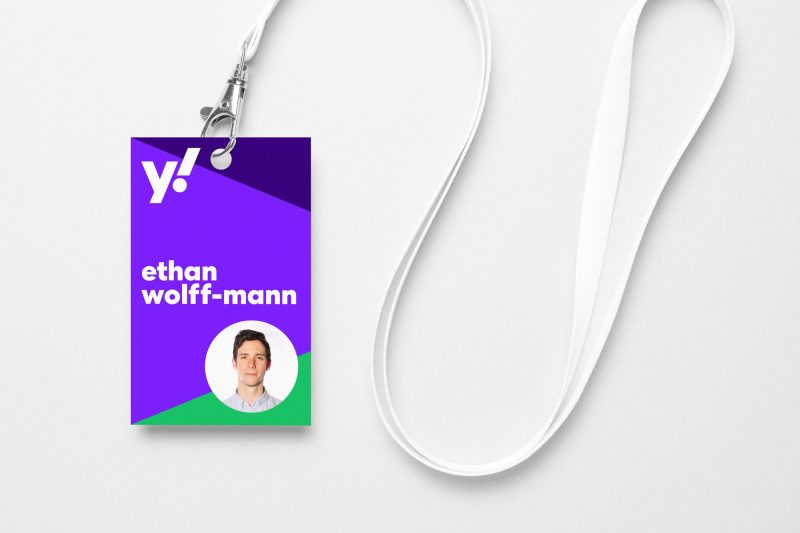
雅虎還活著,還沒有退出市場,它公佈了一個新的標識設計方案,試圖作為系列新動作的起點。這個新標識由 Pentagram 五角星公司設計。
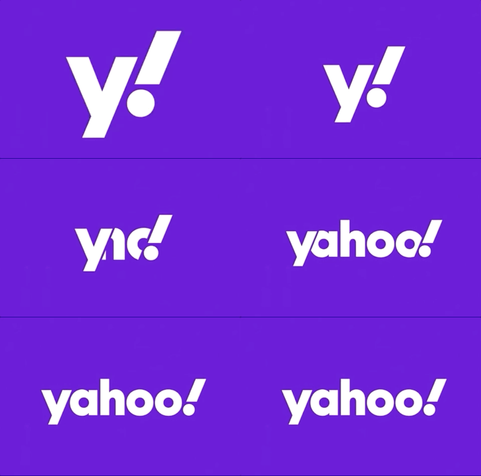
2013年時任首席執行官瑪麗莎·梅耶(Marissa Mayer)也對雅虎進行了大刀闊斧的改革,似乎每次的變革前期都伴隨著視覺語言的變化,6年後的今天,重新設計(調整略嫌無聊)的標誌或許會帶來全新的品牌效應。新標識採用了小寫的無襯線字體,動畫效果中強調了雅虎的標誌性感嘆號,設計公司Pentagram說,新徽標的“ y”和感嘆號都設置為22.5度角度並且向前傾斜,代表了動感和興奮。
Yahoo unveiled its new logo Monday, its third since launching the brand more than 24 years ago.
The new logo looks simple and…regular. “The exclamation point has been italicized for emphasis, as it has in every iteration of the logo since the company’s founding. The “y” and “!” of the logo are both set at an angle of 22.5 degrees (1/16th of a circle), and the branding’s visual language is built around angles and incremental slices.” —Designed by Pentagram (the firm behind the bold, sans-serif designs for Citibank, New York City’s OMNY system, and the Cooper Hewitt museum), the new Yahoo logo marks the first redesign for the company since its big overhaul under the leadership of then-CEO Marissa Mayer in 2013. There was once an interesting project called Yahoo Daily Logo, shot a brand new logo every day but unfortunately the official link was down.


发表评论