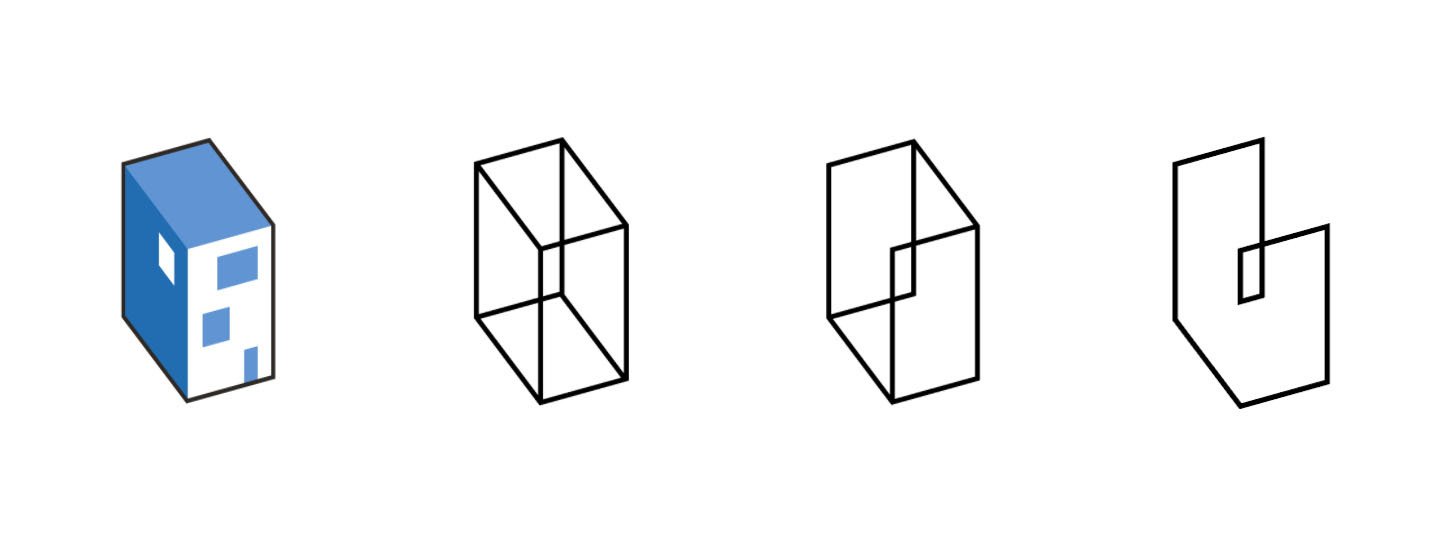
我們都走在極簡扁平的路上。
We will eventually be flat.
ArchDaily just update their new identity with a new logo, which is not be liked in the comments.
ArchDaily 更換了新的網站標誌,藍色軸測建築的輪廓更加扁平。目前的評論聲音中,本次升級似乎並不被認可。

https://www.archdaily.com/975043/archdaily-new-brand-image
As we continue into a new era, that started in 2020 together with Architonic and that continues today with the announcement of our new group DAAily Platforms, we thought it was time for an upgrade and we started to explore what we want to represent as a symbol, connected with our mission and views about architecture.
As architecture evolves, it is no longer restricted to buildings. Understanding the impact that the era of cities is having on our planet, the question of how we live together with all its complexities falls under the broader concept of environment, including the built and the natural, from the scale of the detail to the planet, and even the extra planetary. Another dimension of our environment has to do with the new space that we inhabit, through screens and digital experiences. Today in 2D, and very soon through 3D in immersive and augmented environments. And across all of these, architecture and architects play an important role.
2020年,ArchDaily 和 Architonic 合并,进入了新时代,我们认为是时候做一些改变了,因此我们开始探索如何通过一个符号来重新表达我们的使命,和我们对建筑的看法。
随着建筑行业的发展,它已经不仅仅局限于建筑本身。我们需要了解城市化时代对地球的影响,囊括了更广意义上的建筑与自然概念。从宏观星球到微观细节,如何与所有复杂事物共存,是我们接下来想要探讨的话题。另一方面,通过电子屏幕和数字化体验,我们所居住的环境有了更新潮更多样的可能性。如今的数字化世界的事物,大部分仍然是二维平面的,但很快就会通过3D技术,为体验者提供一个更加沉浸式的环境。在所有的这些背景下,建筑和建筑师都在其中发挥着重要的作用。


发表评论