
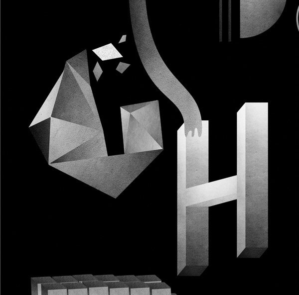
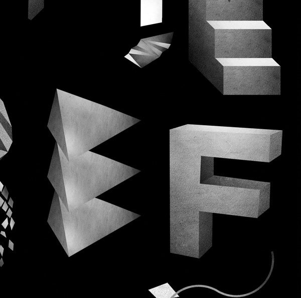
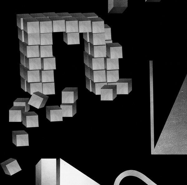
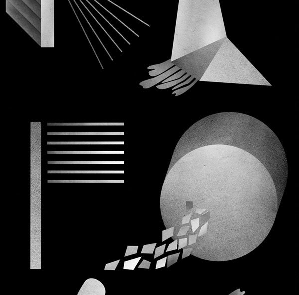
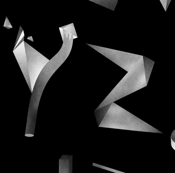
Illustration for the HIFI Magazine in Norway. Created by Hans Christian Øren from Oh Yeah Stduio, Oslo, Norway.
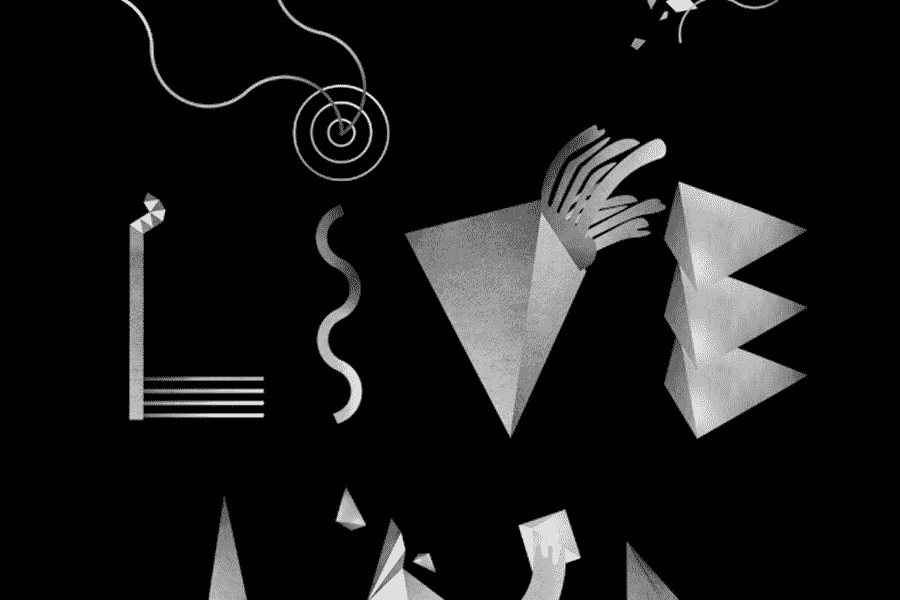
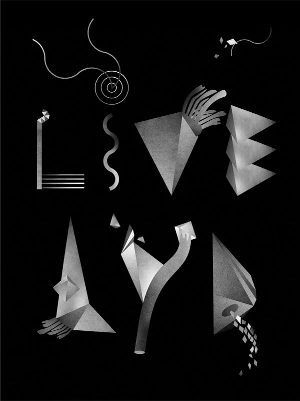
HI-FI klubben is the biggest chain in scandinavian with high quality sound- and image products like stereos, TV, loud speakers etc. Rå Lyd is their magazine that targets the costumers with not only products but more of a experience of good music like concerts and such. This publications theme was the wonderful musician Jarle Bernhoft and Oh Yeah Studio were hired by Gazette (which do the design and layout) to illustrate inside the magazine.
Oh Yeah Stduio 來自奧斯陸,挪威。他們受聘于本地大型音響設備銷售商 HI-FI klubben,爲其内部刊物 Rå Lyd 創造系列字母形象,以靈動、跳躍的形態展示音樂的多樣性魅力。基於品牌形象的獨特氣質,字母本身進使用黑白色彩,並被廣汎應用在企業的產品、刊物及音樂會等場景中。
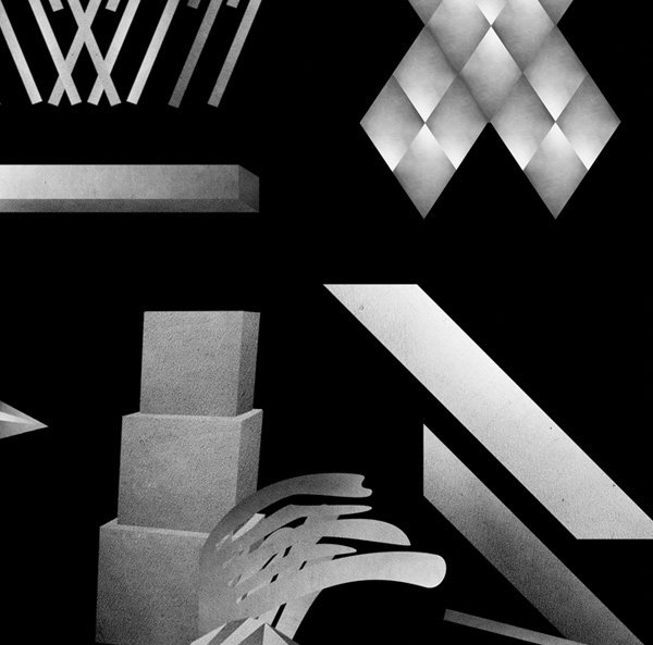
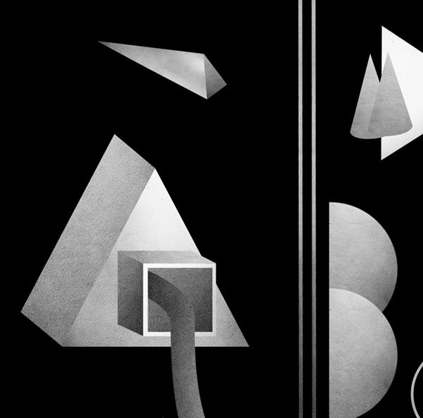
The concept was playful typography in an otherwise fairly dark layout. With play as the theme we kept it all one color not to break with the magazine’s tone and expression. It was important not to make it too naive for the target group even though it was playfull and fun. The type jumps and dances like music does. The project was fun and inspiring as we have designed an entire alphabet of which we visualized as a poster as well. Elements from alphabet was used throughout the magazine.
https://www.behance.net/gallery/2623205/HIFI-Typography
发表评论